Don’t discount email

A lot of people never think about email when they think about social media but in fact email was the very first social media application ever created. Even today, in a world of inbox SPAM, it still provides marketers with value for money. Let’s face it, if it didn’t work, spammers would give up!
Emails are a lot like Web Pages
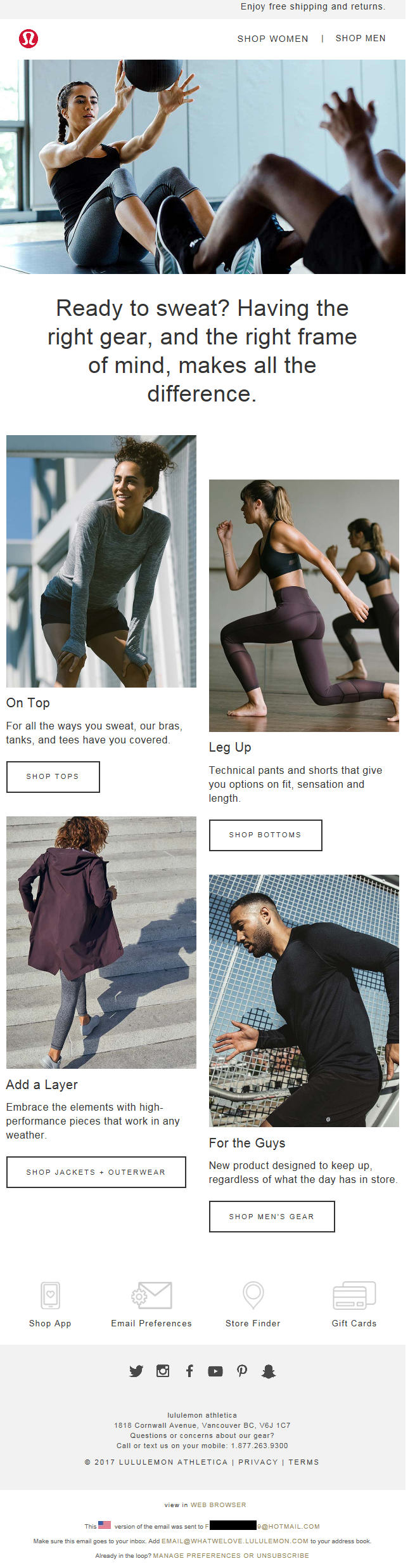
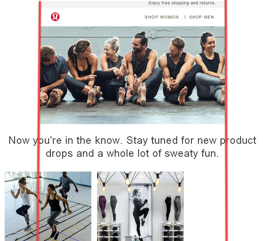
As email evolved from plain text to HTML, it has allowed for improved typography (including color), formatting (think bullet points) and the inclusion of images (even if you have to give permission to download). It is not a coincidence that the layout of emails today now bears a strong resemblance to web pages with a header usually containing a logo, possible navigational element, the actual message and footer to hold the legal mumbo jumbo.
Within the actual message there is often a “hero” image to add some style to the communication followed by some text or the entire message might embodied in an image. Regardless, there is a call to action which generally involves asking people to click on one or more links in the message to take them to a page on your site. You could even equate the Email Subject Line with a Web Page Title.
They need to be responsive
Along with the evolution of web design, emails too have gone responsive so they “work” on desktop as well as tablet and phone. In fact, if you use an ESP, it is likely their tool offers a preview of your email before you send it out so you can see how it would look on each type of device, which is great even if sometimes a little inaccurate.
However the focus on an email’s “responsiveness” has been on the email body rather than the subject line. If you’ve been paying attention then you will have noticed that subjects that fit on one line on desktop or tablet often wrap on phone. But who really cares? Apparently everyone! Recent research indicates that subject lines that wrap can cause the recipient to discount them. How fickle is that?
Subject lines should be short
Case in point is Lululemon, who decided to shorten their email subject lines to avoid wrapping on phones. To their delight, they found it increased their open rate by 38%. Truly. Just reducing the subject to between 21-30 characters.
“Get the latest and greatest”!
Not everyone has seen this same level of improvement. Other reports around 24% but still that is a significant increase. Of course the actual subject has a huge influence on that. Short is good. Engaging (dare we say intriguing?) is even better.
Mobile First does not mean Mobile Only
Since 86% of email is opened on a phone these days, you want to be optimized for mobile:
- subject line less than 30 characters – to fit on one line
- hero image above the “fold” – no scroll to view
- clear easily clickable links – easy to tap.
But don’t be like Lululemon. Apply these email design best practices to your entire email suite, not just your marketing ones.
Make sure once you make them look good on mobile, they still look good on desktop …
And remember don’t “discount” email other than the subject line!