Some Pointers for designing a Logo
One of the most effective ways to establish your brand is to have a stunning logo. So what do we mean by that?
A logo is essentially a visual representation of what your brands stands for. It is probably the first design element that people see and so it has to work the hardest in making the right first impression; it needs to be eye-catching and appealing to your target demographic.
If your demographic would not be willing to wear your logo on a baseball cap then you might have got it wrong.
Logos can be a combination of the following:
- Stylized Name, meaning company name in one or more fonts
- Icon, meaning an image that can be adjacent to or a background to the name, often used as a site favicon and social media avatar
- Tag line, a short piece of text that an expression of your brand voice.
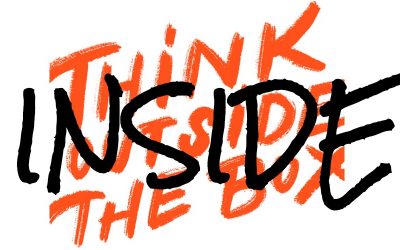
Sounds easy and some logos are deceptively simply (think Nike, Just Do It) but, when it comes to design, simple is generally hard.
Hire a designer
A lot of people try and save money when starting a business but the one thing you should not skimp on is your logo. If you plan to DIY, unless you have the right tools for the job, it simply won’t be technically good enough. Logos are not developed with photo editing apps like PhotoShop. They need to be designed using vector graphics. So even if you do design it yourself, it will need to be redrawn by a professional if you want it to look good on your business cards and website. So do it right, it’s cheaper than doing it over – hire a graphic designer.
 Gather Your Thoughts
A designer cannot create from a blank piece of paper. They need some sort of design brief. So before the clock starts ticking, gather your thoughts. Your logo is the birth of your brand voice and is a core part of your Brand Identity. In fact it should kick off the development of your brand identify. So what (or who) do you want your logo to represent? Think about shapes – corners or round? Think about fonts – script or print? Think about colors – muted or bold? How do you feel about organization? You need symmetry or can you handle other disparate shapes? Are you messy or neat? Do you like to line up the cans in your cupboard or do you throw you socks on the floor? Relaxed, rigid or somewhere in between? Use your answers to give some ideas to your designer so they can mock up some options. But don’t be too prescriptive or you’ll not gain the benefit of their creativity.
Be Noteworthy
You want your logo to stand out. In fact you want it to be wearable. What you don’t want is your logo to look like any of your competition. So do your research but do it after you have ideas of your own. Do it before and you will have muddied the waters of your creative thoughts constraining them to hidden parameters. Last person advantage is never about copying the competition. It is about leapfrogging over them. Doing it better, not the same and not a variation of the same. Again make use of your designer’s creativity, training and skills. If it turns out to be fabulous and you plan to issue an IPO one day then maybe trademark.
Remember Your Audience
Your logo is not all about you. Remember who you will be marketing to because you need to appeal to them. You certainly don’t want to be offending them. You don’t want to confuse them either. If you have an image in your logo and people cannot work out what it is, let alone what it means, you are in trouble. So while you might “get it” if you have to explain it to others, you lost it.
Develop a tagline and a hashtag
Do you have a tag line? If so, it will say a lot about you. Whether your tag line gets incorporated into your logo and is juxtaposed with it on your business card and website, you do need one. So don’t worry about how it will be used. Worry about what is says. It should be a short phrase that makes people go “right, got it”. It should sum up your business in about 3–7 words. Think “just do it”. Or ours “we keep it simple”. If you cannot work it out then you can get help from colleagues. Sometimes it is easier to tell people the story of your business and get them to sum it up for you. Or you can hire a company likes ours to help you. Again if it’s great, you might want to trademark it. And don’t forget, make sure you tag line equates to one or more hashtags #keepitsimple.
Pick your colors
Don’t use more than three colors for your color pallet. And don’t use more than two on your logo. Leave the third for use on your website and social media. Okay you can add a couple more. Make it five at most.
When choosing a color it’s not about what your favorite is. It’s about what message that color will give your audience. There is a lot of information out there about color theory and here is a summary of what different colors mean:
- Blue: trustworthy, tranquil, dependable, medical
- Green: growth, relaxation, instructional, nature
- Red: bold, movement, urgency, sexy, sales
- Orange: energy, creative, friendly, youthful
- Yellow: optimism, youthful, clarity, inventive
- Purple: spiritual, wise, imagination, luxury
- Black: powerful, credible, sleekness, precision
- Pink: romantic, feminine, fun, tenderness
- White: clean, simple, perfection, purity
- Brown: stability, structure, support, history.
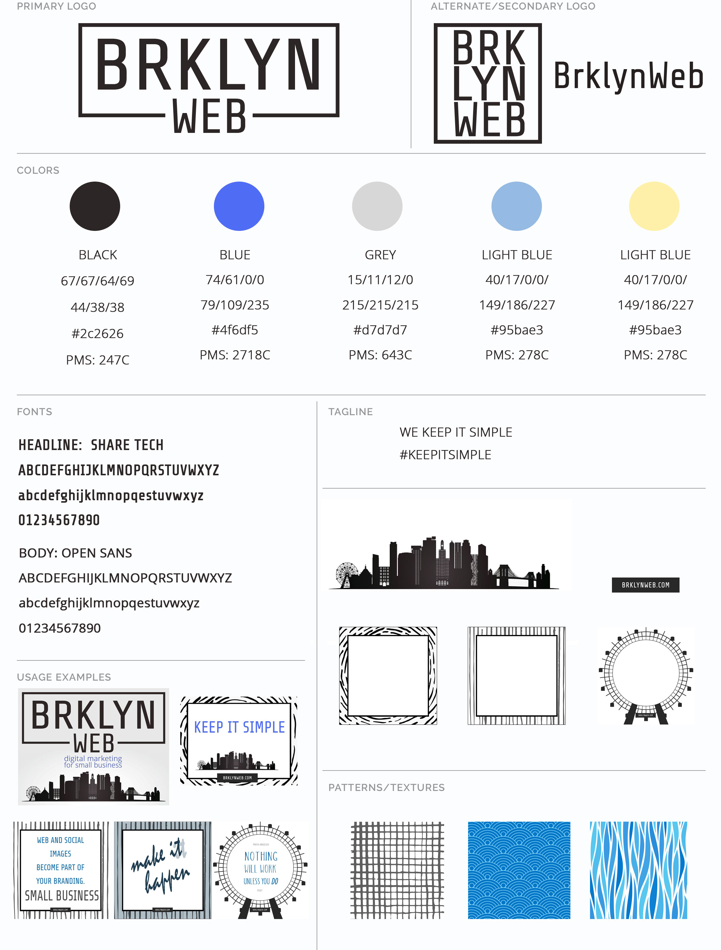 We chose black to keep it simple but also to imply credibility and precision. We like to be organized and to define formulas for doing things. We chose blue for trustworthy and dependable. We also like the idea of “tranquil”. We’re not into stressing about artificial deadlines. No-one is going to die if a Facebook post is not published at 9:00 AM on the dot. We also have variations on those two colors plus a contrast color.
So to keep it simple, pick a primary and a secondary color, variations on those and a contrast.
Don’t forget social media
Your logo has to be adaptable. First, you need a text version for those times an image simply will not do e.g. viewing your website on a phone. This is where a well chosen “headline” font comes in. Second, you need a square version that will cut well to make a circle for your social media profile image as well as an avatar (think Discus). If you have used an icon, it can be used for this. Also don’t forget your website favicon (favorite icon) which is used in the browser and when people bookmark your site or add it to their phone or tablet. If you don’t have an icon then your square logo will suffice. And don’t forget print needs: business cards, postcards, brochures. Yes they still are a thing.
Set a use by date
Ignore people who say your logo should last 10-20 years. This the age of the Internet. We’re used to things changing. Plan for it to be around 3-5 years. Along the way you can tweak it e.g. change colors but nothing drastic. Around the time you decide to redesign your website, factor in your logo. Ask yourself if it still represents your brand. Maybe it’s time to harness what you learnt over those years and produce logo 2.0.
Want to get started working on brand identity? BrklynWeb can actually help. For starters, contact us to get our Brand Identity Photoshop file. We love to share!